Infographics are a tool allowing the expression of an idea with few words. In recent years, they have become a huge deal in social media and online marketing. But what makes them so powerful? Is it the visuals? Is it the text? We believe it’s when both are friends and work together.
Many marketers make the common mistake of focusing exclusively on the design. After all, it’s what grabs the readers’/viewers’ curiosity. The thing they fail to realize is that it’s the copy that keeps their attention on the story they are trying to tell.
There is a right way and a wrong way to design and write infographics and we will make sure to teach you the former.
Choose the Right Format
Define the Theme of the Infographic
The greatest task you’re facing when creating an infographic is choosing the right format and theme. To do that, you must take the time to understand the core of your topic. Only when you have done that, you can begin complimenting your visual elements with text.
A single theme can be approached from different angles. Are you doing a comparison work? Are you trying to present a project with a timeline? Are trying to make complex data more understandable? While this seems like an easy choice, it’s often the element that determines the originality of a piece and what interest it will generate.
Personally, I use Canva to create infographics. It’s easy to use, has countless templates, and enables me to unleash my creativity and make captivating content that tells the stories that I want.
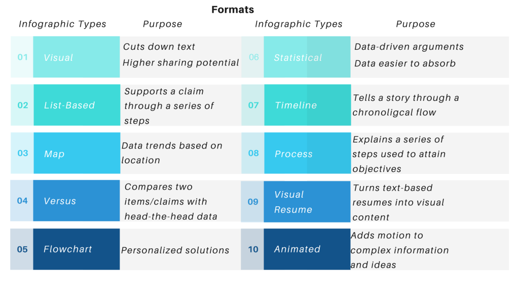
Check out the infographic below to learn about the various formats and the purposes they serve.
Be Concise When Conveying Your Ideas
Keep It Brief but Comprehensive
The most popular and shared infographics have, on average, 230 words. This simple fact reveals four key rules about texts on infographics:
- The visual content is the dominant content;
- The written content should complement the visual elements and direct the attention of the reader/viewer;
- The written content should not distract;
- The written content should be concise and support the presented data;
As a content writer, I am fully aware that generic sentences serve no particular purpose when writing blogs, website pages, product reviews, etc. However, since infographics have limited space for text, such phrases only take up valuable space and ruin the message of the visual content.
Your goal should be to find the perfect balance between message transmission and space consumption. The best way to do that is to be careful with your choice of language. Write statements that support the main points of your infographic and help readers/viewers understand your content.
Keep the Headline Short and Snappy
Good Headlines Generate Interest
The headline is arguably the most important feature of any infographic. It’s the first thing that readers/viewers see and if it doesn’t grab their attention, then they won’t take from their time to read your content.
It should be funny, clever, or plain depending on the subject you’re tackling. Try to hint about what the infographic is about but keep it short, as shorter is simpler and therefore, better.
Use adjectives, numbers, and keywords in your headline. The former two are more efficient in drawing interest while the latter will allow online searches to find your content and will keep you relevant.
Use the following formula to create the ideal titles for your infographics:
Number + Adjective + Noun +Keywod + Promise
Example: “9 Easy Ways to Boost Your Sales” is a more persuasive headline than “9 Ways to Boost Your Sales”. You can also use call-to-action words such as “Try These”, “Act Now”, “Be Quick” to entice your readers/viewers into doing what you want from them.
Control the Narrative Through Structure
Organize Your Thoughts
Every good story that has ever been written has a good structure, and infographics are no exception from this rule. When you’re aware of your content’s framework, you will be able to plan more easily the message you’re trying to convey.
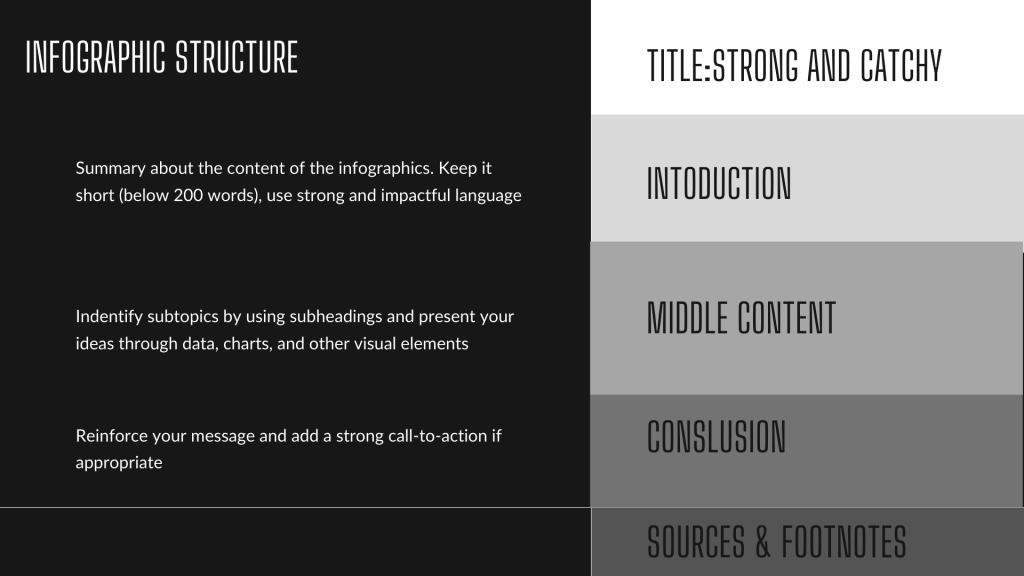
After you come up with a strong and catchy title, you must write an introduction that sums up what your infographic is about. Think of it as an extension of your headline. Use few but powerful words and strong verbs to help the readers/viewers get immersed in your narrative.
Keep track of your introduction’s wordcount. If it reaches or exceeds 200 words, start editing. Delete any unnecessary and filler words and phrases and make sure your text is complementing your visual elements instead of diluting them.
Next comes the middle (main) content. This is the spin of your infographic and should contain subheadings that identify the different topics and allow the reader/viewer to navigate between them. You can also add data and charts that support your claims and make the content easier to absorb.
The final two elements of an infographic are the conclusion and sources & footnotes. The former should summarize your theory and reinforce your argument. Make sure it has a compelling call-to-action when appropriate. The latter is used to mention your sources if you’re using external data.
Find Balance Between Text and Design
Writing Tips to Follow
Having two or more sentences back to back will most likely overwhelm the infographic you’re creating and saturate the visual elements. You can prevent that from happening by following these five rules:
- Use font hierarchy to set apart headers and descriptions;
- Use icons, coupled with bold typography, to make them nexus points;
- Highlight the most important text through bolding, colors, or letter spacing;
- Write texts that focus on the core of your message;
- Whitespace is of key importance. Make sure it’s present between the text and visual elements.
Always Finish With Proofreading
Don’t Jeopardize Your Work Because of a Typo
Ask any copywriting agency that specializes in professional content writing services and they will all tell you that your work can easily go to waste because of a typo or missed comma. Take the time to carefully proofread your infographic to make sure the spelling, wording, and grammar are correct. Readers/viewers are more enticed to believe sources with well-written articles.
“Say What You Have to Say in the Fewest Possible Words” — Arthur Bryant
Talk to you soon!
Koko


