Among all other advertising techniques, perhaps the pop-up is the one we all hate with the strongest passion.
In my mind, the human equivalent of pop-up ads is this annoying nag in the center of Rome that will try to sell you a flower by just putting it into your hand before you realize what’s happening. Yep, nobody likes those. Yet, sometimes they succeed and persuade the person to give them some money just so they can escape their presence.
But, that’s not the type of relationship you want with your customers. If your website is using pop-ups and you don’t want them to annoy or stir its visitors away, my argument is you should hire good content writers and designers to make your pop-ups work. Or just to make your website alluring and interesting enough so people don’t lose interest.
Why Nobody Cares About Pop-Ups
Simple psychology of attention
It’s not that nobody cares about the pop-up. The more correct way of putting it is that people hate them.
Especially when it’s in the form of a modal ad that won’t let you proceed to read the content underneath until you interact with it somehow. Nielsen Norman Group researched the most hated online advertising techniques and can you guess what they found? Yep, you probably got it. Pop-ups were at the top of the list. But why is that? Well, their research gravitated around the following:
- Interrupted focus and loss of orientation
- Lack of choice
- Intrusive and forced interaction
- Unnatural slow-down of the reader’s flow
When the most valuable thing right now is the attention of your website visitor, allowing any of these to obstruct their experience on your page is a huge no-no.
So, It All Comes Down to Minimalism
It’s still relevant
And I know I’ve covered the topic of minimalism in terms of content writing, but here we’re talking about the whole package: the design, the user experience, the imagery, and of course, the actual words on the page.
As UX and website designers are focusing on enhancing the functional and visual usability of your site and content writing specialists focus on the words that your visitor will read, the pop-up becomes the middle ground for those areas.
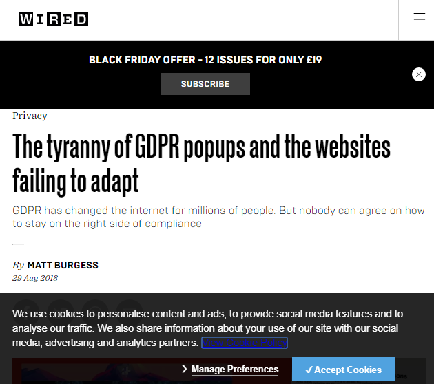
There are some pop-ups that are not even promotional and quite frankly, you can’t escape using them on your website. Such are cookie policies and GDPR-related messages. Like the one below.
But we are not talking about them. We are talking about the ones that make you put in your email for a free e-book, regular emails, or some other promotional campaign.
Is There a Way to Make a Pop-Up Sexy?
Sexy might be pushing it, but effective & less annoying, definitely!
I think so, yes. You just need to get your timing right. With all that being said above, have I subscribed to email lists from pop-ups? Yes, many times. Have I downloaded free PDF guides that I will probably never open? I sure have plenty waiting in my mailbox.
But, I have done so after first being convinced by the main website content that I want to engage further.
1) Timing
So, besides the content writing that goes into creating a non-sucky pop-up, timing is the other most crucial thing. Will you give a chance to the reader to finish the paragraph and get left asking for more? Or will you design your pop-up in a way that just blocks every other function on the page and gets in their face with some shameless self-promotion?
It’s your choice.
2) Wording
But, Vicky, if nobody reads the pop-up, why should I bother that much with writing it well? – I hear you ask.
Because if you get the timing right, the right wording is the next step to getting people on board with what you want them to do.
If it is urging people to subscribe to your email newsletters, you need to give them a reason to do so. This is the type of content you might need to hire writers for.
You know what I hate?
Passive-aggressive pop-ups. Yes, you know what I am talking about. The ones that block your screen and present you with two buttons along the lines of “Yes, I want to receive your monthly dose of awesome content.” or “No, I don’t care about *insert something the reader probably cares about*.
This is like saying “Oh, you won’t subscribe to my email… Then you clearly don’t have a good taste.” Don’t do it, really.
3) Design
Here, I include UX too. Modal ads (the ones that shade the rest of your screen and won’t let you click away unless you interact with the pop-up) are forbidden territory if you want to avoid annoying people.
Also, don’t hide the closing option, give people the freedom to choose, they will appreciate that.
Make the message simple and avoid stuffing information or not including enough. Use colors to accentuate the different actions and create contrast between them (closing vs. entering your email, for example).
With all that said, let’s look at a good example for a second.
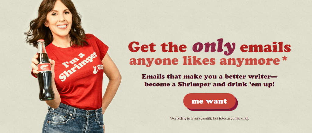
One of my favorite content writers, Laura Belgray. Here’s what you will see on her home page.
☑️ Good Design
☑️ Attention-grabbing message
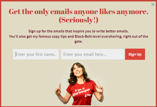
Once you click on the “me want” button, that’s when you get the actual pop-up.
You have shown interest by clicking, it wasn’t shoved in your face, leaving you with no choice, therefore…
☑️ Timing
Furthermore, you know exactly what you are signing up for. This gives you the peace of mind that it won’t be anything irrelevant that will make you regret this decision later.
In Conclusion…
Doing pop-ups the right way
Research has now proven that people don’t like pop-ups. But that’s only because there are advertisers out there that abuse them. In reality, it might be an effective tool if you know how to create one that doesn’t suck and that people will read. It’s just a matter of timing, good content writing, and design. Simple, right?


