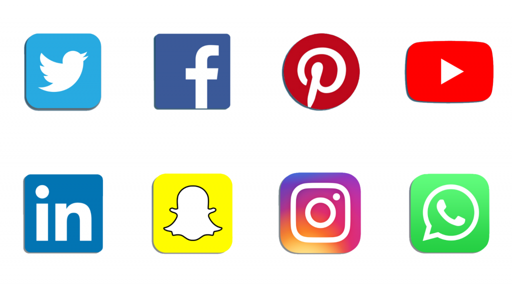
Social media has become omnipresent in every field of life, industry included. It has forever changed the way we do business. It has given customers a voice and a platform where they communicate directly with their service providers.
It has altered the way companies create and share content with their consumers. This has directly impacted the way logos are designed. Now more than ever, it’s important for businesses to have brands that are social media-friendly.
The Role of the Logo for Your Business
Why Is Design Important?
Think of your logo as your business’s persona. It shows professionalism and is meant to tell your company’s story. Your logo will forever be associated with your business, which is why you must choose its design carefully. It’s arguably the decision that makes the difference between failure and success. So no pressure at all!
Well-designed logos combined with quality copywriting give brands recognition and put companies on the map. They allow businesses to widen their network and stand out among their competitors. When they are social media-friendly, it enables brands to be identified across various platforms. That ultimately attracts people and enables companies to target new audiences.
Don’t Believe Them, Size Matters
The Smaller, the Better
Size is the one thing that social media has affected the most when it comes to logo designs. Nowadays, people are spending more and more time on their personal devices and on social networking platforms.
This means that designers must create logos that are immediately distinguishable at about 8mm (depending on your phone or tablet’s size). During the pre-smartphone-era, logos were most commonly used in email signatures, on storefronts, on packing, and on the top bar of websites. 50mm was the smallest logo size, which is six times larger than the present-day standard.
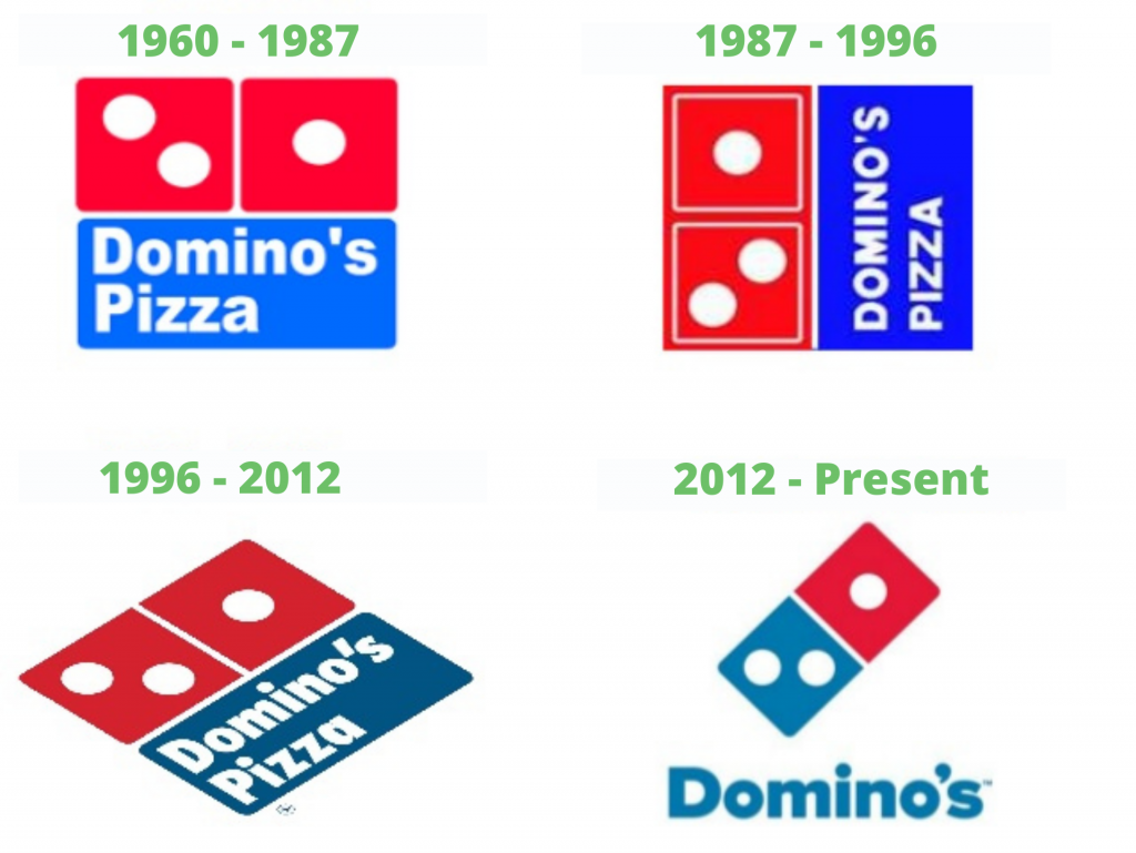
A perfect example of brand evolution due to the development of social media and smart technology is Domino’s Pizza. They launched a new logo in 2012, which proved how powerful and recognizable their brand is by removing the word “pizza” as they believed that the world understands what they offer.
Fewer Colors, Greater Impact
Multiple Tones Create Unwanted Clutter
Before social media, many companies opted for large and colorful logos that are easy to remember and identify. They wanted to create vibrant images that can be seen from afar when placed on billboards, promotional materials, storefronts, packaging, etc.
The invention of social networking platforms changed that. Today, colorful and complex logos look cluttered and unprofessional when they are reduced to 8mm. That forced many designers to rework existing logos or create new ones by using only two to three tones as they stand out better on social media.
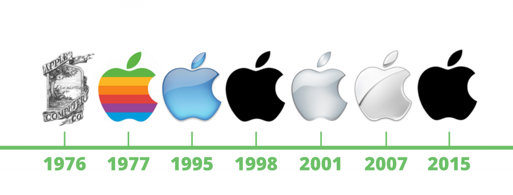
Apple’s logo is a good example of how the use of colors has changed since the introduction of social media. Their rainbow-colored logo was used from 1977 to 1995 and is their longest-running logo. The first social media website, Six Degrees, was launched in 1997 and a year later, the company replaced its glossy blue apple with a matte black logo. During the 21st century, Apple introduced two glossy-grey logos, which were replaced with their matte black counterpart in 2015 as they were getting lost in the backdrop of social media.
Adaptive Logos Will Become a Standard
They Allow Companies to Express Their Position
Known as ‘Logo Systems’, these logos have a framework that can be modified without compromising the identifiability of a brand. They have become so popular that they will soon be a standard in logo making.
Adaptive logos present a unique opportunity for businesses to alter their logos and raise awareness of ideas, situations, and topics. Their inception has given designers the chance to expand their creativity and explore new techniques.
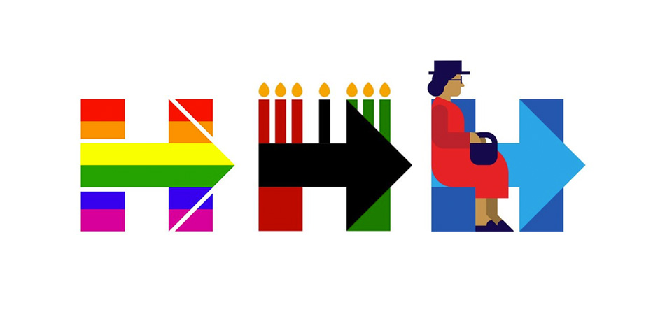
Perhaps one of the finest adaptive logos on social media is Hillary Clinton’s logo for her 2016 presidential campaign. Crafted by world-famous designer, Michael Beirut, the logo features the letter “H” and a forward arrow, which symbolizes progress. In the image below you can see three variations of it. The first raises awareness for LGTB rights, the second celebrates the Kwanzaa, and the third commemorates Rosa Parks while remaining distinguishable.
Instant Feedback Isn’t Always a Good Thing
Social Media Can Influence Designers
When a logo is introduced, the feedback from social media users is instant and unfiltered. Men, women, and children share their opinions and that can be productive but also scary.
Designers and companies often use online comments to make corrections that render their logos more acceptable. However, this can also force logo creators into designing something new, fresh, and clever, in the hope that their work will be loved, instead of what is right, which can be demotivating and uninspiring.
As a copywriter for a content writing agency, I understand the pressure that comes from customers and readers. While I try to use their feedback to hone my skills, sometimes, it can lower my morale and put a halt to my desire to write. Still, I wish to believe that more people appreciate my effort and that is what keeps me running.
“The strongest logos tell simple stories” – Sol Sender
Talk to you soon!
Koko


